
Divi is a really great theme with a lot of flexibility. However, the drop-down menu is something we quickly have had enough of. Often you can identify that a page is using Divi just by looking at the menu. The colored line below it, the distances, the hover color. We never fully understood why so many people spend so much time on creating good liking layouts but barely take care of the default look and feel of their menus.
In this post, we want to show you a really cool alternative to the boring default drop-down and give you an example of how you can style your Divi menu to not only look way cooler than the average but also show you some neat little tricks for styling WordPress menus in general. For this, this post is separated into 3 sections:
- Using Divis mega-menu
- Styling the drop-down menu
- Adding custom images and icons to your menu
The Divi Mega Menu
It’s sad that there is no setting or even a hint in the theme customizer that this exists (well maybe there is something in the documentation but who has time to read that, am I right?). We used Divi for about one and a half years when we first heard about this awesome treasure, hidden in the depths of the theme’s code.
The mega menu basically lets you create a single full-width dropdown with multiple submenus inside it and visible at the same time. Yes, the menu on this site is a mega-menu as well – a custom styled, though. To activate the mega-menu, all you have to do is to add “mega-menu” to your menu’s top-level menu entries CSS classes. Keep in mind that it works best if you have 3 levels of menu entries. The first level gets the “mega-menu” class. The second levels are then the “categories” and the third level are the entries.
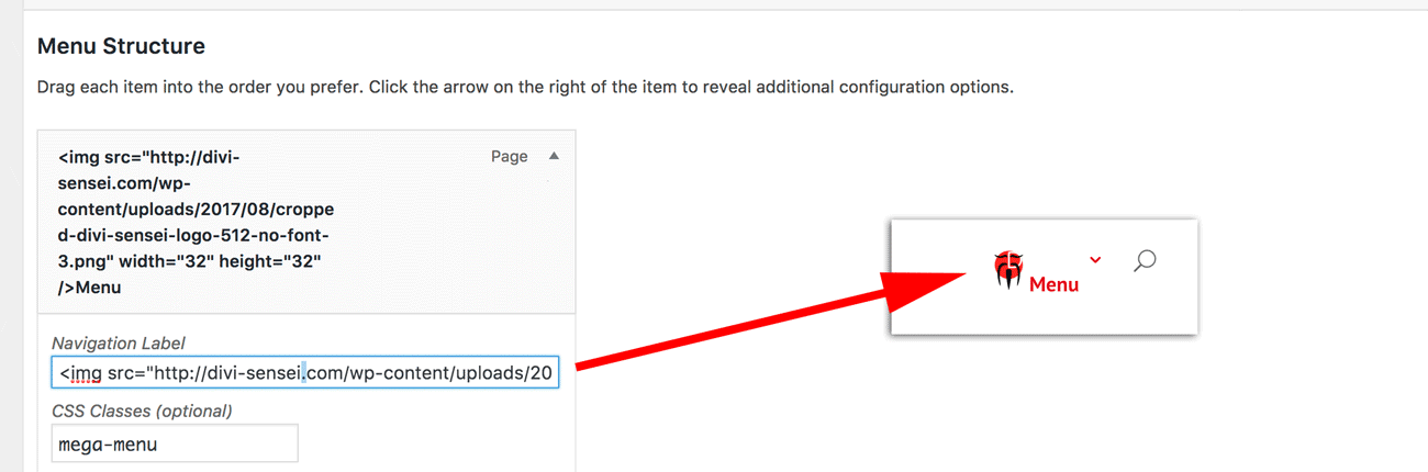
Check out the menu structure for our page. “Menu” is the top-level entry (by the way, you can have multiple top-level entries with the “mega-menu” class). The second level is the “categories” like blogs, themes and modules. The third level is then the entries that are listed under the categories (e. g. the blog categories under the blog section).
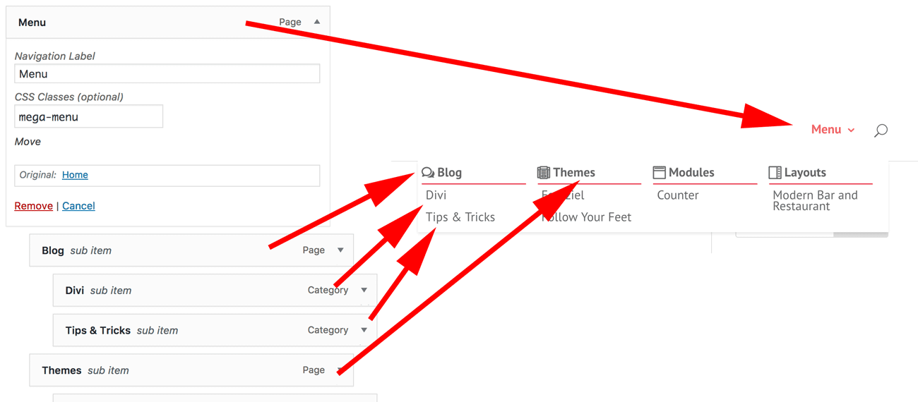
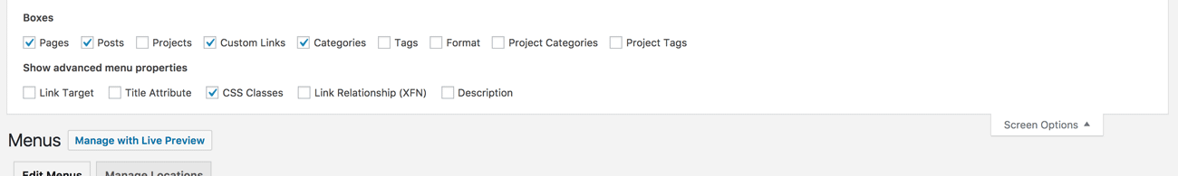
By the way, if you don’t have the CSS field in your menu, you have to activate it in the Screen Options. Generally, the Screen Options are often overseen and are available in a lot of different places. You should check them out more often. ?
That is basically it. You are now able to use the Divi Mega Menu. It is indeed that simple. However, it will look different to what our menu looks like. Probably more that. That’s because we added some CSS to style our menu. This brings us to the next section.
Styling the drop-down menu
There are various tutorials on how to style the WordPress navigation. However, we want to show you how we styled ours. At this point, we would like to thank and credit Geno Quiroz, from who we have gotten most of the styling. He has an awesome tutorial to style the mega menu here.
Here is the customization he came up with:
/* standard drop down */
    .nav li ul {
        width: 160px;
        padding: 0px 0 3px;}
    .nav li li {
        line-height: 14px;}
    .nav li li a {
        font-size: 13px;}
    #top-menu li li {
        margin: 0;
        padding: 0px 5px;}
    #top-menu li li a {
        width: 150px;}

/* mega menu drop down */
    #top-menu li.mega-menu > ul {
        width: 600px;
        padding: 5px 5px;
}

    #top-menu li.mega-menu > ul > li > a, #top-menu li > ul > li > a {
        padding: 7px 5px 7px;}

/* default or centered style header mega menu alignment */
    .et_header_style_left #top-menu li.mega-menu > ul {
        left: auto!important;
        right: 0;}

    .et_header_style_centered #top-menu li.mega-menu > ul {
        left: auto!important;}

    .et_header_style_centered #top-menu > li:last-child.mega-menu > ul {
        left: auto!important;
        right: 0!important;}


/* first row of titles */
    #top-menu li.mega-menu > ul > li > a:first-child {
        border-bottom: 1px solid #cc2a2a;
        font-weight: bold;}

/* sub-menu items - 2nd level */
    .nav li li li a {
        font-size: 13px;}

    #top-menu li li a {
        padding: 0px 5px;
        font-weight: 300;}

/* drop down menu items on hover */
    .nav ul li a:hover {
        opacity: 1;
        background-color: rgba(150,150,150,0.3);}
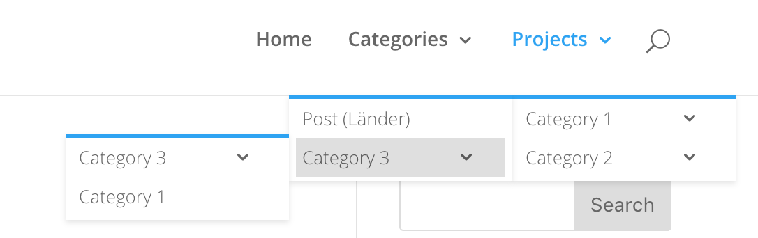
Please note that we already applied our primary color and some other color changes here. Well, that alone might work for his page or the sake of the tutorial he wrote but this brings a few downsides. Let’s look at what happens if we only apply this CSS:
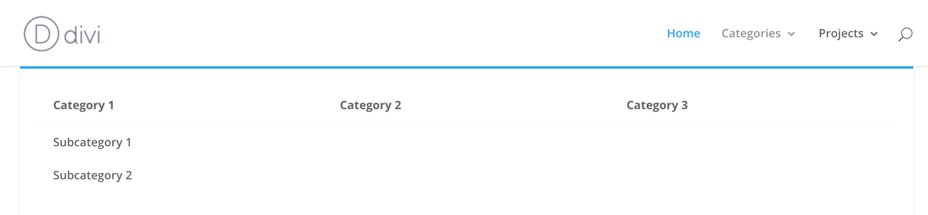
As you see, the mega menu looks slimmer already but what about the default dropdown? The first level indeed looks okay as well but if you have a sub-menu in there, it totally breaks the menu. So let’s fix this by adding the following CSS. Notice that we use the “:not()” pseudo element to explicitly exclude the mega-menu from using these styles.
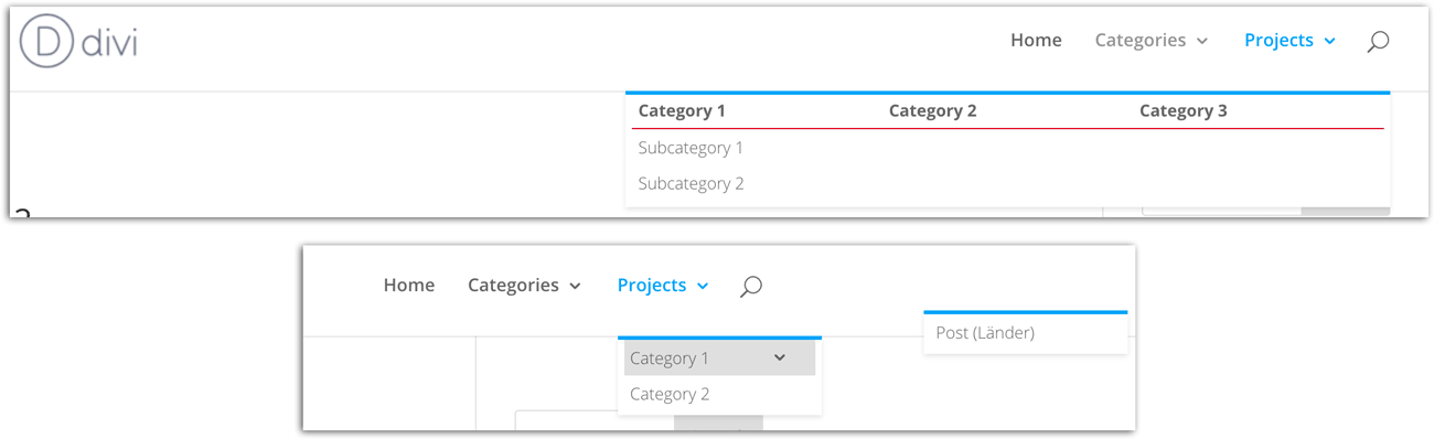
#top-menu li:not(.mega-menu) li ul {
    left: 160px;
    top: -3px;
}

#top-menu li.et-reverse-direction-nav:not(.mega-menu) li ul {
    right: 160px;
    left: auto;
}
This will put subsequent sub-menus in the right place. It also adds back the functionality to open sub-menus to the left when there would not be enough space otherwise.
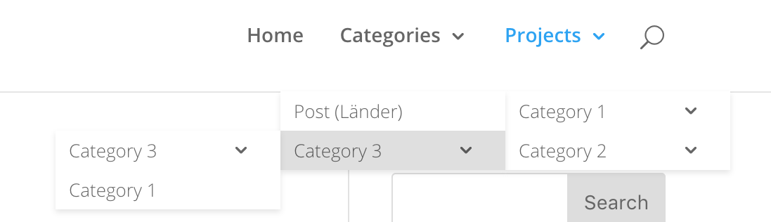
Next, let’s tackle the blue line. Though it might work for your page, it not only is the first-class indicator that you are using Divi but it also makes every Divi page somehow look the same and maybe you or your clients just don’t like it. So let’s get rid of it. We do that by removing the top border from the sub-menu. Add the following to your CSS:
/*use #top-menu-nav li ul instead to remove border on desktop menu only */
#et-top-navigation ul {
  border:none;
}
This will remove the border on the mobile menu as well but if you only want to remove it on the desktop, use the #top-menu-nav instead of the #et-top-navigation. Now since we removed the border, the sub-menus are missing 3px of height so go back to the “#top-menu li li ul” selector and change “top: -3px;” to “top: 0px;”. Now the sub-menus are back in place.
We find, that the link should fill the whole sub-menu so add this CSS code as well:
#top-menu-nav li:not(.mega-menu) ul {
  padding: 0;
}

#top-menu-nav #top-menu li:not(.mega-menu) li {
  padding: 0;
  width: 100%;
}
#top-menu-nav #top-menu li:not(.mega-menu) li>a {
  width: 100%;
  padding-left: 10px;
}
The result looks like this and we are pretty happy with it:
There is only one thing which really annoys us. As soon as you are not hovering accurately over the top-level entries, the drop-down is collapsed immediately. If you are looking for a fix for this issue, you should check out the tutorial we have written on this topic: prevent Divi Mega Menu from collapsing.
The last thing we like to style is the currently selected page in the mega-menu. By default, Divi overwrites the currently selected page with a blue color but we also want to show off the ancestor of the currently selected page. Therefore we added this CSS:
#top-menu>li>a,
#top-menu li.current-menu-ancestor>a,
#top-menu li.current-menu-item > a {
  color: #cc2a2a !important;
}
Adding images and icons to your menu
If you want to add a visual pleasing decal to your menu, you have basically two options. You can use images are an icon font like Font Awesome or Divis built in one which is called “ETmodules”. You then again have two options on how to get that into the menu. You either can use HTML (most people don’t know that you can use HTML in the menu titles field) or CSS.
The HTML Way
The HTML way is probably the easier approach. Simply create a <img> tag with your desired image and add it to the menus Navigation Label.
You can either style the image inline or you could use the CSS Classes field to add additional classes so you can target your image. In this case, you could use one of these selectors to select the image:
- .mega-menu img
- .menu-item img
- #top-menu a img
A good idea could be for example to vertically align the image with the text, change its size or do whatever else pleases you.
The second option is using :before or :after pseudo elements to add content manually. That is by the way how we did things in our menu. First, we added a bunch of classes to our second menu level (blog, etc.) and then used this CSS to add the icons using the Divis icon font.
/*******************************************
Icons for menu entries of mega menu
******************************************/
.menu-blog:before {
content: "w";
}
.menu-themes:before {
content: "";
}
.menu-modules:before {
content: "";
}
.menu-layouts:before {
content: "";
}
.menu-blog:before,
.menu-themes:before,
.menu-modules:before,
.menu-layouts:before {
position: absolute;
font-family: ETmodules;
font-size: 16px;
font-weight: 800;
padding-top: 10px;
}
.menu-blog > a,
.menu-themes > a,
.menu-modules > a,
.menu-layouts > a {
padding-left: 20px !important;
}
@media all and (min-width: 981px) {
.menu-blog:before,
.menu-themes:before,
.menu-modules:before,
.menu-layouts:before {
top: 0;
left: 0;
padding-top: 0px;
}
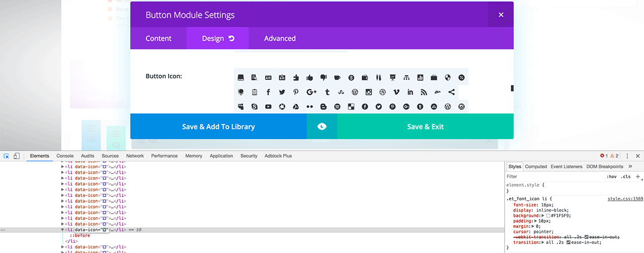
What’s that square you might ask – depending on which browser you are currently using. Well, that’s the unicode character used by the icon font. Though they look the same since the browser does not know how to render them appropriately, they are in fact different. If you wonder where you can get them from, simply fire up the Divi Builder, open a module with an icon field (like the Button or Blurb module) ad open your browser’s element inspector. By inspecting the icons, you can out the unicode character to use.
Now it’s just a matter of copying and pasting the character from the data-icon field to your CSS.


[…] menu looks awesome and especially the mega-menu is one of our favorites – thats the one we are using on this page. However, it sometimes can […]
Thank you for this article.
Finally a detailed article on how to achieve
an original menu.
The customization of the menus would really
a in Divi and Extra themes.
Hello mate! i’ve found a new mega menu plugin for Divi.
What do you think ?
https://wordpress.org/plugins/quadmenu-divi/
Thats an really interesting alternative. I like that it also works with other Themes than Divi and the free version is surely worth a try 😉
Can you tell me the exact HTML you are using?
Hi Jan,
Thanks for your fast respons. This is the url I used:
Binnen Stucwerk
Binnen Stucwerk
Yeah, that is probably due to spam protection. 🙂 Glad you figured it out and I hope this article was helpful. 😉
It seems I can’t copie the url in this reply field?
Hi Jan, I found the solution on Elegant Themes. I copied the url without the quotes and that worked for me. Thanks again for your respons -:).
Hi Jan, Thanks for this. I just about got things working, however, I for the life of me can’t figure out how to have the mega menu show up directly below the top nav. It’s always moved over to the far right. I have also tried the CSS code to keep it from collapsing immediately which sort of works but it just has it disappear but reappear with a flash. Weird. Would you mind providing some thought to it?
Cheers
Sure but I would need to have a look at your page. Are you using many plugins? Sometimes plugin add their own CSS and it conflicts with Divis own CSS. Bootstrap for example has a container class which causes conflicts with Divi.
This works great – thank you for this post. I want the menu to collapse on a mobile. I have found a few posts on this and tried to integrate it but the menu disappears. Any help would be appreciated!
Thanks for the post. I have it working. What i would like to get working is to collapse the mobile menu. I have followed the Divi posts on how to do this but there seems to be some conflict in the css with this.
Do you have any suggestions?
well this is one great relief to read this article. Clearly Divi needs specialization on its own and I’m wasting my time learning it rather than learning to code from scratch. Thank you for this great article.
how would i add a module, like a contact form to a drop down mega menu?