
In this article, we will cover the necessary steps to make something work that currently annoys a whole lot of people who use Divi: the uneven sized cards in the Divi Blog Grid module.
We highly recommend you read through the whole article to understand what we are doing and why we are doing it, so in case a future Divi update breaks the code, you can fix it yourself. It’s always good to understand the things you do instead of simply copy-pasting snippets which you don’t understand.
The JavaScript code we will use is quite easy to understand and besides that, we also need a little bit of CSS knowledge. Both are skills that every website owner should have a basic understanding of – and even if you don’t know much about JS and CSS, today is the day you can learn your first of many lessons?
The Problem
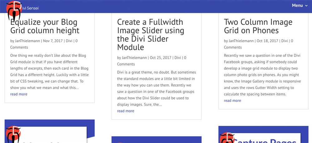
Let’s start with the problem. It’s always good to know what you want before you start. A clear goal avoids confusion on the way. So what’s the problem with the Divis Blog Grid module? Nothing, if you like masonry layouts. But what if you want equally sized cards? That is not so easy. We could say:
How can we make all cards equally sized in the grid?
The module is lacking any settings to equalise the height of the cards. Pure CSS also won’t work due to the module’s HTML output. On desktops and tablets, Divi puts all the articles in multiple, independent columns. That prevents us from using CSS to get equally sized cards – at least without giving fixed height values to all articles – but that either leads to overflowing text or weird empty areas. It would be better to have a dynamic way of finding the largest visible article and adjust the height of all other items. Now the problem becomes clearer again:
How can we find the largest article in the visible grid and apply its size to all other visible article in the same grid?
Now that sounds like a good description of the problem. We can easily solve this kind of task using JavaScript. Let’s do it! It’s not so difficult. ?
The Solution
Let’s gets to the solution. We’ll go over it piece by piece. If you are just here for the code, feel free to scroll all the way to the bottom to just copy the finished result. But don’t complain or blame us if something is not working. Read through the tutorial and you’ll be able to fix any issues yourself. Now everybody: grab a coffee or a tea, get seated and enjoy the show.
Preparing JavaScript and running your first lines of code
We start with a simple script tag. We’ll need it for putting our own code in Divis Theme options later. If you are more advanced and want to use the code in an existing JavaScrip file, e. g. from your Child Theme, you can skip this step.
<script>

</script>
In between the script tag, we can now start writing our JavaScript. To make it a little bit easier to deal with the HTML, we can use jQuery. jQuery is just a library for JavaScript, which comes with a lot of handy functions. It’s already shipped within Divi so we can just make use of it. But jQuery in WordPress comes with one limitation or downside. You have to write “jQuery” instead of the short form “$” every time you want to use it, which can be quite annoying. So to enable the “$” shortcut, we encapsulate our actual code in a function and pass jQuery itself as the argument to the function. By defining the parameter of the function as “$”, we now can use $ as a synonym for jQuery. Add this code in between the script tags
(function ($) {

})(jQuery);
Enough with the preparations, time to start coding. So what are the steps to achieve our goal? Let’s break them down:
- Get all the visible articles
- Find out which one the largest is
- Get the size from the largest article
- Apply the size to every other article
So how do we get the articles? Well, we can use jQuery to get any HTML element on the page, if we know the CSS selector of that element. So let’s check the HTML of our blog grid to find out the required CSS selector. To do that, use your browser’s debug tools. Every major browser comes with some sort of these tools. Often you can access them by right-clicking somewhere on a website and choosing “inspect”.
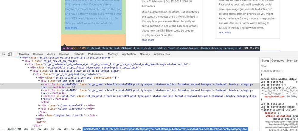
If you see this screen for the first time, it might look a bit scary but in reality, it just wants to be your best friend. In the upper left, you have the element selection tool (the one with the cursor on it). If you click it, you can click on any element on your page and the corresponding element will light up. In the lower part, you have the HTML on the left and the CSS on the right. This is the complete HTML and CSS as it is seen and interpreted by the browser.
After selecting the article in the grid, we can see a bunch of things. First of all, every article seems to be an “article” element. Articles are organised in three columns. The columns are inside a tree of “div” elements. The outmost element, which is the blog grid itself, has the classes “et_pb_module”, “et_pb_blog_grid_wrapper”, “et_pb_blog_0” and fourth class which just happens to be “sensei-grid”. But this is no magical coincidence. We actually gave the blog this class intentionally. Why? There are multiple reasons: we might want to use the code on multiple pages of the same website but we do not want to use the functionality we are developing on every single blog grid on the whole site. That’s why we use a custom CSS class. Then we can decide on which blog grid we want to enable the functionality and other modules on the same site are not affected.
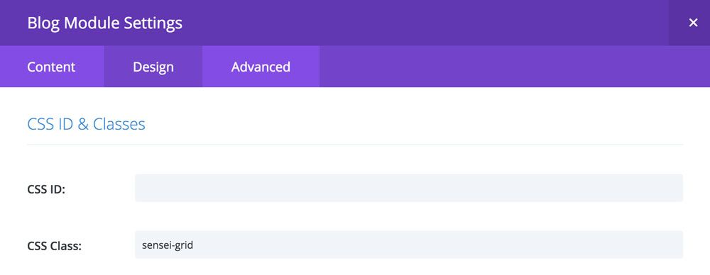
Of course, you could also use any other element selector to get a common surrounding element of the columns. For the sake of this tutorial, we will go with “.sensei-grid”. The “.” before the element indicates that it is a class. In CSS you can address elements by their element tag (e. g. “article” or “grid”), by their CSS ID (e. g. “#myelementid”) or their CSS Class (e. g. “.sensei-grid”). In the Advanced tab of your modules, rows or sections you can add your own CSS ID or multiple classes. Here you don’t add the “.” but just the classes you want (e. g. “my-first-class my-second-class”). So let’s find out how tall the articles are. Write this code inside the jQuery function we created earlier:
$(document).ready(function () {
$(".sensei-grid").each(function(){
$(this).find("article").each(function(){
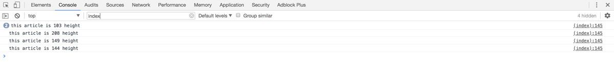
console.log("this article is " + $(this).height() + "px height");
});
});
});
First, we use the “$” to call jQuery. We pass in “document” – which is a JavaScript keyword, a reference to the “page” which the code runs on – and then call the “ready” function to which we pass a callback. We do this to tell jQuery that we want to wait till the whole document (the current page) is ready. If the page is not ready, we can’t safely manipulate the content. Instead, we simply wait. Once the document is ready, the function we passed to the “ready” function gets executed by jQuery.
Inside the callback, we use jQuery again. This time to get each Sensei Grid. We simply pass the CSS selector to jQuery and get all the elements. In CSS, a class selector can return multiple elements. Since we could have two or more blog modules on the same page, we want to find the largest article for each one separately so using the “each” function and passing in another callback function, we can execute the same code multiple times.
Again we use jQuery but this time with the “this” keyword, which is a reference to the outer element on which we run the “each” function. Imagine you have two blog modules. jQuery will find the first one and “$(this)” will be the blog grid with the classes “sensei-grid” and “et_pb_blog_0”. When jQuery runs the same callback for the second module, $(this) will represent the blog grid which has the CSS classes “sensei-grid” but this time it has the class “et_pb_blog_1” – another module.
Next, we use the “find” function to find every “article” element inside the blog module. This will find all articles, no matter in which column they are. But only in the current module. Since we now again potentially have more than one result, we use the “each” function again to iterate over each article. Now we can finally print out the height of each article on the console.
The full code by now should look like this:
<script>
(function ($) {
    $(document).ready(function () {
        $(".sensei-grid").each(function(){
            $(this).find("article").each(function(){
                console.log("this article is " + $(this).height() + " height");
            });
        });
    });
})(jQuery);
</script>
Copy the code and head over to your Divi Theme Options. Select the “Integration” tab and paste the code into the “Add code to the < head > of your blog” field.
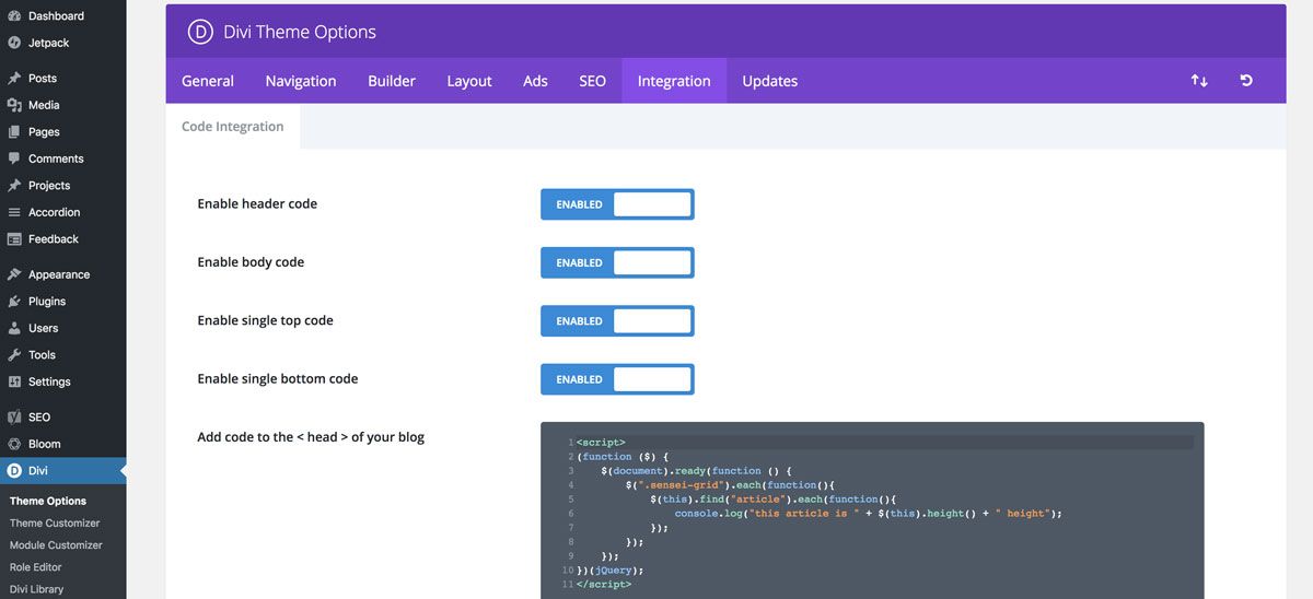
Save your settings and open the page with the blog grid. Open the inspector of your browser again, but this time check out the console. If you have done everything right, you should see the output. Maybe you need to force refresh the page by holding down the shift key on your keyboard while refreshing the page. Also sometimes caching plugins can be an issue and you might need to purge the cache to see the result.
Get the tallest article and change the other articles heights
Alright. Now that we have all the articles in the blog module and know their individual heights, it’s time for the next step: find out which article is the tallest and then apply its height to all other articles. To do this, we can simply store each height in an array and then use the JavaScripts Math library to find the largest number in this field. The last step is to use the max value and apply it to the other articles. Since we need the articles multiple times, let’s remove the innermost each loop (starting with “$(this).find(…)” and instead use this code.
var articles = $(this).find("article");

var heights = [];
articles.each(function(){
    var height = 0;
    height += $(this).outerHeight() - $(this).height();
    height += $(this).find(".et_pb_image_container").outerHeight(true);
    height += $(this).find(".entry-title").outerHeight(true);
    height += $(this).find(".post-meta").outerHeight(true);
    height += $(this).find(".post-content").outerHeight(true);
    heights.push(height);
});

var max_height = Math.max.apply(Math,heights);

articles.each(function(){
    $(this).height(max_height);
});
We still first get all the articles but this time we store all the articles in a variable called articles. Then we create an array to store the heights of each article. Next, we loop over each article, calculate the height from its content and save the height in the array.
Are you asking yourself where the 4 class selectors come from? We used the inspector again to look at the HTML structure of each article. You’ll find that these are the exact elements in our article. But we also need to consider paddings and borders. We can calculate that by subtracting the element’s height from its outer height.
Once we have all the heights, we can use the Math library to get the max value from the array and store it in another variable (learn more about Math here). Finally, we loop over each article again and set the height to the value we previously found. Phew. Our code now should look like this:
<script>
(function ($) {
    $(document).ready(function () {
        $(".sensei-grid").each(function(){
            var articles = $(this).find("article");

            var heights = [];

            articles.each(function(){
                var height = 0;
                height += $(this).find(".et_pb_image_container").outerHeight(true);
                height += $(this).find(".entry-title").outerHeight(true);
                height += $(this).find(".post-meta").outerHeight(true);
                height += $(this).find(".post-content").outerHeight(true);
                heights.push(height);
            });

            var max_height = Math.max.apply(Math,heights);

            articles.each(function(){
                $(this).height(max_height);
            });
        });
    });
})(jQuery);
</script>
Refresh the page with the blog grid and you already should see the result. If not, you might need to force a refresh again. You might ask yourself why we calculate the height of the article by using the individual content heights instead of simply using outerHeight() on each of the articles. Why it is important to calculate the height from scratch in each run, we will see in a second.
React to size changes
There are a bunch of things going on under Divis hood which can cause a size change of the blog grid’s content. But not only that. The user could simply resize the browser or flip the screen of a mobile device. That can activate certain media queries and the size of the content changes. We need to react to size changes and recalculate the article heights based on the new content size. If we would use the articles outerHeight() we would run into problems as after the first calculation run all articles already have the same height. Therefore the height will never change after the first run.
Okay, so let’s handle size changes. Modern browsers support Mutation Observers. A MutationObserver is a JavaScript object which allows you to monitor changes in a given element. This in combination with an observer on the window should be sufficient for us to deal with the content size changes.
$(".sensei-grid").each(function(){
    var blog = $(this);
    equalise_articles(blog);

    var observer = new MutationObserver(function (mutations) {
        equalise_articles(blog);
    });

    var config = { subtree: true, childList: true };
    observer.observe(blog[0], config);
});

function equalise_articles(blog){
    var articles = blog.find("article");

    var heights = [];

    articles.each(function(){
        var height = 0;
        //height += $(this).outerHeight() - $(this).height();
        height += $(this).find(".et_pb_image_container").outerHeight(true);
        height += $(this).find(".entry-title").outerHeight(true);
        height += $(this).find(".post-meta").outerHeight(true);
        height += $(this).find(".post-content").outerHeight(true);
        heights.push(height);
    });

    var max_height = Math.max.apply(Math,heights);

    articles.each(function(){
        $(this).height(max_height);
    });
}
As you can see, for better reusability we moved the code from inside each loop of the sensei-grids into its own function. We do this for better reusability. In each each-loop, we now get the blog grid we are iterating over. We pass each grid to the function we just created. This will apply in the first round of equalising the heights. Then we set up a MutationObserver for each blog grid.
Every time the MutationObserver detects a change inside the module, it will call the callback function we pass into the constructor. Of course, we use this opportunity to re-apply the equalising. Finally, we need to handle a resize of the browser window. We can observe the browser window for resizing and yet again equalising the blog grids.
$( window ).resize(function() {
    $(".sensei-grid").each(function(){
        equalise_articles($(this));
    });
});
Our code now looks like the following:
<script>
(function ($) {
    $(document).ready(function () {

        $( window ).resize(function() {
            $(".sensei-grid").each(function(){
                equalise_articles($(this));
            });
        });

        $(".sensei-grid").each(function(){
            var blog = $(this);
            equalise_articles(blog);

            var observer = new MutationObserver(function (mutations) {
                equalise_articles(blog);
            });

            var config = { subtree: true, childList: true };
            observer.observe(blog[0], config);
        });

        function equalise_articles(blog){
            var articles = blog.find("article");

            var heights = [];

            articles.each(function(){
                var height = 0;
                //height += $(this).outerHeight() - $(this).height();
                height += $(this).find(".et_pb_image_container").outerHeight(true);
                height += $(this).find(".entry-title").outerHeight(true);
                height += $(this).find(".post-meta").outerHeight(true);
                height += $(this).find(".post-content").outerHeight(true);
                heights.push(height);
            });

            var max_height = Math.max.apply(Math,heights);

            articles.each(function(){
                $(this).height(max_height);
            });
        }

    });
})(jQuery);
</script>
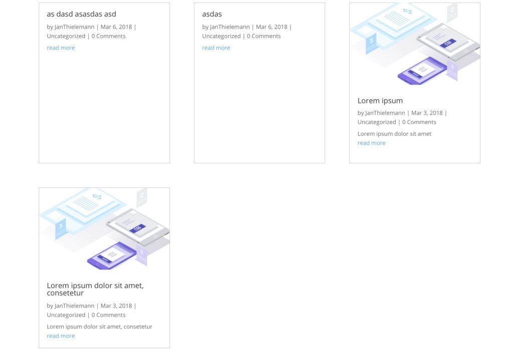
So far so good. When you reload the page, you will see that the articles’ heights are perfectly equal. Also when you resize the browser window you still should end up with a nice, equalised blog grid. Here we created some articles to show you what it looks like when you don’t have images on all articles:
Fixing the paging
Speaking about images. There is one last thing we need to take care of. When you enable paging on the blog grid module and click the button to show older entries, you’ll run into a problem. The articles are completely wrongly sized. That’s because the images take some time to load which interferes with our calculations. So the final step is to add yet another function in which we can call our function to equalise the heights after the images are loaded:
$(document).ajaxComplete(function(){
    $(".sensei-grid").imagesLoaded().then(function(){
        $(".sensei-grid").each(function(){
            equalise_articles($(this));
        });
    });
});


$.fn.imagesLoaded = function () {
    var $imgs = this.find('img[src!=""]');
    if (!$imgs.length) {return $.Deferred().resolve().promise();}
    var dfds = [];
    $imgs.each(function(){
        var dfd = $.Deferred();
        dfds.push(dfd);
        var img = new Image();
        img.onload = function(){dfd.resolve();}
        img.onerror = function(){dfd.resolve();}
        img.src = this.src;

    });
    return $.when.apply($,dfds);
}
As you might know, the Divis blog grid uses Ajax to load older entries without leaving and reloading the whole page. We can use this to our advantage and wait till the Ajax call finishes. We then use a little helper function to execute our own code after all images inside the grids have been loaded. Once the images are completely loaded and their size is known, we can re-calculate the heights. Now we get the correct height including the image and no article is too short – no text is cut off.
The helper function is a little bit “advanced”. Basically, we scan each grid for images and then use the Promise library to execute some code after certain conditions are met. In our case the loading (or the failure to load) of the images of the blog grids.
Final Code and Thoughts
That’s it, we are done. Let’s have a look at our final result. It came out with less than 100 lines of code and wasn’t too hard to create or was it? This is what your code now should look like:
<script>
(function ($) {
    $(document).ready(function () {

        $( window ).resize(function() {
            $(".sensei-grid").each(function(){
                equalise_articles($(this));
            });
        });

        $(".sensei-grid").each(function(){
            var blog = $(this);
            equalise_articles($(this));

            var observer = new MutationObserver(function (mutations) {
                equalise_articles(blog);
            });

            var config = { subtree: true, childList: true };
            observer.observe(blog[0], config);
        });

        function equalise_articles(blog){
            var articles = blog.find("article");

            var heights = [];

            articles.each(function(){
                var height = 0;
                //height += $(this).outerHeight() - $(this).height();
                height += $(this).find(".et_pb_image_container").outerHeight(true);
                height += $(this).find(".entry-title").outerHeight(true);
                height += $(this).find(".post-meta").outerHeight(true);
                height += $(this).find(".post-content").outerHeight(true);
                heights.push(height);
            });

            var max_height = Math.max.apply(Math,heights);

            articles.each(function(){
                $(this).height(max_height);
            });
        }

        $(document).ajaxComplete(function(){
            $(".sensei-grid").imagesLoaded().then(function(){
                console.log("images loaded");
                $(".sensei-grid").each(function(){
                    equalise_articles($(this));
                });
            });
        });


        $.fn.imagesLoaded = function () {
            var $imgs = this.find('img[src!=""]');
            if (!$imgs.length) {return $.Deferred().resolve().promise();}
            var dfds = [];
            $imgs.each(function(){
                var dfd = $.Deferred();
                dfds.push(dfd);
                var img = new Image();
                img.onload = function(){dfd.resolve();}
                img.onerror = function(){dfd.resolve();}
                img.src = this.src;

            });
            return $.when.apply($,dfds);
        }

    });
})(jQuery);
</script>
If this was your first time using jQuery and you have not understood everything we did here: no worries. The more you use JavaScript and jQuery, the more you will understand. But hey, maybe you are now interested in starting to learn JavaScript at all. If so, we recommend reading or watching a few tutorials on the web or on YouTube to get a better understanding of what’s going on. We hope it was not too difficult to follow.
If you already have experience with jQuery, this should be easy enough to be understood well, or isn’t it? If so, let us know in the comments. We hope you enjoy this little tutorial. Let us know what you think and would you like to see little snippets like that in the WordPress Plugin Directory as a free download?


WOOOOHHHHOOOO!! This has beeen driving me crazy for so long. Thank you. Tried the CSS way with no luck but this way worked! Is there a way to hide the excerpt and meta, so its just the image and title?
The meta can be hidden using the switches in the module settings. For the excerpt you can simply add “display: none;” to the Content field on the Advanced tab.
This is truly awesome, you guys rock, it’s exactly what I’ve been looking to do for weeks. Thank you.
Many thanks for this, it works really well on the first page, however when you navigate to “Previous Posts” this card outlines are far too short and the text spills over the area.
Any idea on ho to fix this?
Many thanks
Andy
Hi, Please ignore the previous comment!
Error between Keyboard and Chair!:) Managed to stuff up the copy and paste!
Andy
great! thanks,
Just my read more buttons don’t align at the bottom?
Just wanted to say thanks. This worked great and was just what I needed.
Thanks for this! Still works as of today.
Works great – thank you!
Thanks 4 this great tutorial and for the in depth explanation 😉
Is there a way to stick the “Read more” button to the bottom of the cards?
Great job, thanks! How to apply this for desktops only? Just like we use with css @media only screen and (min-width: 768px)
does not work at all.
Thanks for your help, much appreciated.
Thanks for this – really appreciated. I tried the CSS method on your other post without success, but this worked perfectly!
Thanks for saving my sanity and explaining the logic behind it. I have no coding experience (thank goodness for Divi), but at least I understand some of the logic now. I have a question. I want to run a plugin formatting before the measuring and equalizing. I know the code did that for the picture loading. I’m pretty sure the plugin code is https://codepen.io/andytran/pen/BNjymy (the plugin is from Divi 100 Article Card https://www.elegantthemes.com/blog/divi-resources/free-divi-extension-gives-the-divi-blog-module-a-brand-new-look). I tried to look it up, but I don’t understand enough to know what to write and where. Thank you!
Hey there, thanks for this. This works great if i use the blog module in divi builder. But doesn’t quite work right in category/archive pages. It only shows 170px. Please help with that. Thanks
So very grateful for this! Thanks so much!
Thanks for the great article! It’s worth to mention that “Fixing the paging” might not work correctly when you have enabled Lazy loading images in Jetpack addon (on the Performance tab).
Lifesaver! Thank you for this tutorial! I really don’t know why this isn’t a built in option in the Divi theme. Seems like a no-brainer to have as a design option.
This is amazing – except it doesn’t work on blog modules in cat/archive pages. Still, it’s a decent way to style on other pages. Cheers!
Is there a way to do this on a row by row basis, instead of for the entire blog module?
This is awesome! Thank you.
This is a brilliant bit of code. Thank you!!
Hi, thank you so much for this! Very clear guide, learned many things here, plus this is a must!! Cheers from sunny south of France 🙂
Fantastic, thanks for this, works like a charm.
After searching for ages, this suddenly worked. A big thank you
Not sure if anyone is still looking at this article, but thanks for the help! It worked pretty well on my site, but when the site first loads the cards are taller than they need to be (lots of white space at the bottom below the excerpt and “Read More” button) but if you adjust the browser window’s size all the cards snap to the correct fit / sizing. Any thoughts on how to address that?
Would also love to know how to put the Read More button at the bottom if that’s easy to explain.
Thanks!
You are the men. Thank you so much.
GREAT JOB MAN… THANKS
Love this!
I’ve been using it for quite a while now and on a fair few sites, only issue is, I’ve recently noticed a bit of an error and I can’t for the life of me figure out why…
For some reason when the page loads, it seems to make the articles bigger than they need to be? I think it could be to do with a stylesheet being applied late and resizing an element? although I’ve seen it on a couple of sites, not just one… Weirdly though, I tried wrapping equalise_articles(blog) in a setInterval function and this did not seem to do the trick either? Weirder still… If I left the interval function running, it would eventually sort itself out after multiple tries?
I’m a little lost with this, I’m no expert with Javascript and don’t understand the whole function but it seems like simply retrying the function should have sorted the issue?
Window resize works every time without fail… so not sure why the document.ready trigger doesn’t work for me?Love this!
I’ve been using it for quite a while now and on a fair few sites, only issue is, I’ve recently noticed a bit of an error and I can’t for the life of me figure out why…
For some reason when the page loads, it seems to make the articles bigger than they need to be? I think it could be to do with a stylesheet being applied late and resizing an element? although I’ve seen it on a couple of sites, not just one… Weirdly though, I tried wrapping equalise_articles(blog) in a setInterval function and this did not seem to do the trick either? Weirder still… If I left the interval function running, it would eventually sort itself out after multiple tries?
I’m a little lost with this, I’m no expert with Javascript and don’t understand the whole function but it seems like simply retrying the function should have sorted the issue?
Window resize works every time without fail… so not sure why the document.ready trigger doesn’t work for me?