
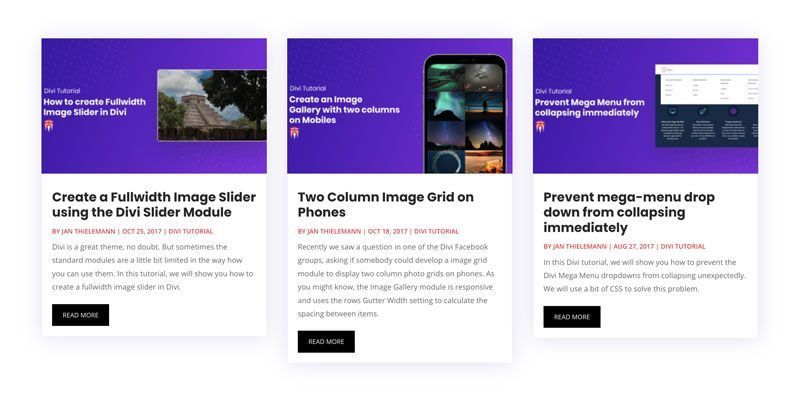
One thing we really don’t like about the Blog Grid module is that if you have different lengths of excerpts, then each card in the Blog Grid has a different height.
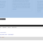
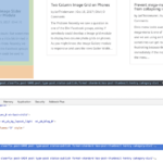
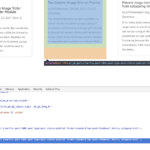
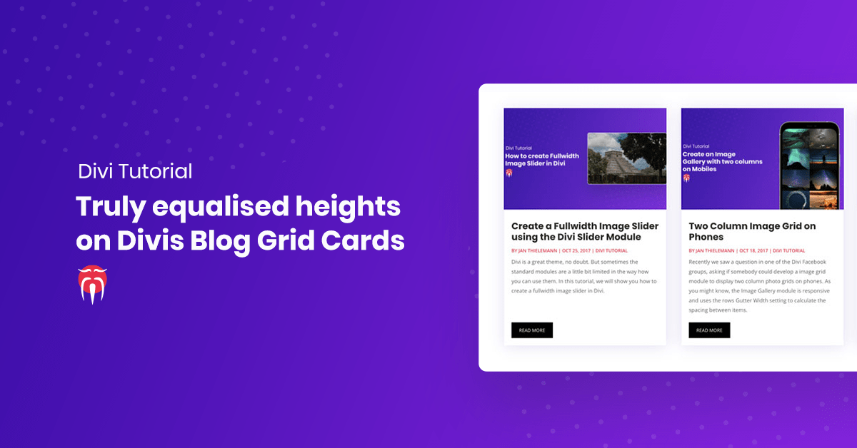
Luckily with a little bit of CSS tweaking, we can change that. To show you what we mean and what this tutorial is about, we will go from this:
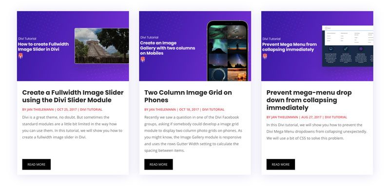
to this:
But before we tell you the CSS, let’s talk about what we need to do. After all, you are here to learn something and not to only copy some code without understanding it, right? Okay so the things we are trying to achieve are:
- Each column of the Blog Grid should have the same height
- The read more button should align nicely at the bottom of the card
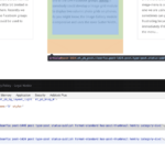
To achieve this, we need to take care of a few things. Let’s start by inspecting the structure of the module to find out, what’s going on and where we can hook ourselves into. Right-click anywhere on the page and use your developer tools to inspect the HTML structure of your page. Alternatively, choose “View Sourcecode”. With the inspection tool, you can hover over the different elements of the module. We immediately notice that the columns have different heights.
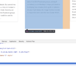
Fortunately there is a simple fix to give elements a flexible, yet equal height: flexbox. To do that, we simply display the parent container as flex and give our columns a flex value of 1 which basically means: fill your parents’ container even if you are smaller. The parent container with the “display: flex” attribute then gets the height of the tallest element and each smaller element fills the gap. Since we are playing around, let’s not add the CSS to our actual Divi Custom CSS but only to the inspector so we can make sure everything works before we mess up our site.
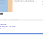
Okay, the columns now have an equal height but the cards still look different. Let’s take care of that. Again we first inspect to see what’s going on. We notice that the “article” element has different heights.
Again we use flexbox to fix this. We do so by displaying the columns as flex as well but this time we use a flex-direction of the column instead of a row. Besides that, we give the “article” element a flex value of 1 so it fills its parent no matter what, just like we did before with the columns.
Finally, we need to do something so the read more button sticks to the bottom. Yes, you guessed it right: we will use flexbox for this. Once again we display something as flex and use flex: 1 on a child element. This time, the “article” and the “post-content” are our targets. Oh, and to be able to use justify-content on the “post-content”, we also display it as flex.
Okay, now that we know the CSS we need, we can wrap it up and put it in our Divi Custom CSS field. We don’t want to affect any other elements that by accident have the same CSS classes so let’s give the Blog Grid module a custom CSS class and put this class in front of each customization we made. The final CSS should look like this (we also polished it up a little bit for cross-browser compatibility with this tool and to fit the margins of our page, you might want to adjust the values to your liking):
/*Equalize Blog Columns*/

.bloggrid .et_pb_salvattore_content {
  display: -webkit-box;
  display: -ms-flexbox;
  display: flex;
}

.bloggrid article {
        margin-bottom: 20px !important;
	-webkit-box-flex: 1;
	    -ms-flex: 1 0 auto;
	        flex: 1 0 auto;
	display: -webkit-box;
	display: -ms-flexbox;
	display: flex;
	-webkit-box-orient: vertical;
	-webkit-box-direction: normal;
	    -ms-flex-direction: column;
	        flex-direction: column;
}

.bloggrid .post-content {
	-webkit-box-flex: 1;
	    -ms-flex: 1 0 auto;
	        flex: 1 0 auto;
        display: -webkit-box;
        display: -ms-flexbox;
        display: flex;
	-webkit-box-orient: vertical;
	-webkit-box-direction: normal;
	    -ms-flex-direction: column;
	        flex-direction: column;
	-webkit-box-pack: justify;
	    -ms-flex-pack: justify;
	        justify-content: space-between;
}

.bloggrid .column {
        margin-bottom: 20px !important;
	display: -webkit-box;
	display: -ms-flexbox;
	display: flex;
	-webkit-box-orient: vertical;
	-webkit-box-direction: normal;
	    -ms-flex-direction: column;
	        flex-direction: column;
}
That’s it, that wasn’t too hard, was it? If you want to learn more about the powers of flexbox, there are a lot of good tutorials out there. Like this one from css-tricks.com. We hope that today you learned something and if so, we would love to hear from you in the comments below.


I really want to get this working on a site that I am developing. I added the css but no difference to the appearance. I must be missing something, but I don’t know what. Are you able to help please?
Hi Alanna, I think you miss to add the CSS Class bloggrid to the blog module in the “Advanced Settings”
Hey,
great job with the css code! I guess the explanation is quite good too, but I’m happy I didn’t have to read it 😉
Thank you. Exactly what I was looking for.
That’s cool, thanks! But won’t work when you have 3 columns but the number of displayed posts is not a 3 multiplier…
Exactly the problem we are having…
This would be better as a video, in my view. I found it too wordy and too much to read. The option to watch a video tutorial would have been preferable for me. I’m sure I’m not alone in regard to this.
Yeah true. I’d love to do more video tutorials but I rarely find the time unfortunately 🙁
I much prefer written tutorials over videos hands down; don’t let anyone talk you out of what you are doing and doing well!
I totally agree. Videos are lovely when you start a new subject but if you are looking for a certain detail it’s impossible to scan and find it. Thanks for the tutorial dear Jan T. It helped me a lot!
Thanks for posting this – been searching for a solution forever, getting close, but it appears it aligns the whole grid, but not each row of 3 in a grid of say 3×3? Is that possible?
Alternatively, does using flex enable a fixed height container for the excerpt with overflow:hidden – nowrap and ellipsis – tried, but couldn’t get it to work.
Cheers
It is indeed possible. Have a look at our blog. There is a second article on how to equalize a blog grid using some JavaScript.
Where should I copy the CSS to?
The CSS field at the bottom of the Divi Theme Options page
Honestly, it’s annoying having to read SO much text. Messy. At least needs a clear short explained solution at the end 🙂
The post has barely 700 words xD
It’s annoying to read a few hundred words to learn something valuable.
I guess I must be getting too old for this cause this kind of responses leaves me facepalming myself.
Where is this supposed to go?
Under BLOG SETTINGS > ADVANCED > CUSTOM CSS there are several sections…. for example, there’s before, main element, after… and the list goes on. Please check the current update of DIVI and let me know. Thank you!
It goes under the general Divi settings in your WordPress Backend. Go to Divi Theme Options and scroll all the way to the bottom. Your Blog Module only gets the CSS class in the CSS Class field on the advanced tab of the module settings.
This was the solution I needed! Thank you for posting!!
Doesn’t work with 3 columns -_-. Man I hate Divi.
[…] Equalize Your Blog Grid Column Height Source: http://localhost:8888/ds-old/blog/2017/11/07/equalize-blog-grid-column-height/ […]
I can’t believe how many people are complaining about having to read an article. People, sometimes you need to work a little to get some results.
Thanks Jan for putting this together and taking the time to explain how it works. I haven’t got it working right on my site yet, but your explanations will help me figure it out.
Thanks for this Divi fix. I really enjoyed it.
However, I did encounter a slightly annoying consequence of this fix: a bit of space was added between the image and the headline. I tried to rewrite the excerpts to get them more the same size, but to no avail. Is there any way to minimize that space between the image and the headline? Or is that just the byproduct of this column equalizing approach?
What is the css class that I’m supposed to put into the CSS class is the module advanced tab? I tried “.bloggrid” and “.bloggrid .et_pb_salvattore_content”. Neither of those did anything.
Totally agree with Kevin. “I can’t believe how many people are complaining about having to read”
People understanding the solution you are being presented with is part of learning.
Jan excellent article css spoton solution, although I would recommend always using a child theme.
Thanks.
A few comments…
This works when you have 1 row, because it equalizes all columns in the module irrespective of the rows created in the display. 2×1, 3×1, 4×1 all work fine if your number of articles equals the columns. A 2×1 grid and 3 articles will look bad. Does that make sense?
If you display more than 1 row, you need to go with the jquery option.
In the current version of Divi, .bloggrid has been renamed .et_pb_blog_grid
Thanks for that Travis! I was beating my head against a wall wondering why my third columns are a mess! Your comment should be highlighted at the top of this article.
Hi, thank you for the great tutorial! It works fine with my 3 columns. But I now have lots of space between image and title. Do you know how I can reduce that?
Great, thanks!
Super, thanks.
[…] Credit: Divi Sensei […]
Worked like a charm! Thank you so much! 🙂
I just use
.et_pb_blog_grid .column .et_pb_post {
height: 350px;
}
That works for me
I think people who have issues with reading article and getting annoyed, should improve reading habits. Otherwise, why visit websites to search for their solutions 🙂
Wonderful Article. Thanks for your efforts.
Thank you for the careful explanation. Very helpful! I was missing one of the places to add the flex and your article showed me my error. Thank you!!!
Thanks for the tute!
I found using your CSS code combined with setting old salvattore to height of 450px worked better for me than the java fix which left quite a bit of white space at the bottom of each post
Thank you sooooo much – this is the only instruction I have found that works!!
This is awesome thank you!
So much searching for a solution that didn’t involve a load of ET J Query.
You CSS is really nice and compact. Forget about row columns and modules – just put the class in the module CSS and it’s done. Well done.
Thank you for this solution! A few months ago, I had to tackle a similar issue for a client’s website. Although I’m quite comfortable with CSS, the HTML structure made me think it would take longer than I’d like. So, I opted for a quicker workaround at the time—using jQuery to dynamically adjust the heights of all columns in a row to match the tallest one. While it worked, I was never fully satisfied with it, as the resizing effect was noticeable if you looked closely. Luckily, the columns were mostly below-the-fold, so it wasn’t too much of an issue.
Now, I’m working on another site with the same problem, but this time I had the luxury of researching a better solution—and I found it here! It’s surprising that we’re still searching for fixes like this in 2024, but I’m glad to have found one.
Thanks again!