
The Problem
Recently we saw a question in one of the Divi Facebook groups, asking if somebody could develop an image grid module to display two column photo grids on phones. As you might know, the Image Gallery module is responsive and uses the rows Gutter Width setting to calculate the spacing between items. Here is such a gallery which is inside a row with a custom Gutter Width of 1:


As you resize the browser, you can see that at some point, the grid changes from 4 columns on desktops to 3 columns on tables. Then 2 columns on smaller tablets and finally you end up with 1 column on phones.
The solution: CSS Media Queries
Luckily for the person in trouble, there is a very simple solution to solve this problem: Media Queries. If you are not familiar with media queries, basically all they do is apply certain CSS only if a given criteria is met. For example you can apply CSS to an element only if the screen size is smaller than a given amount of pixels.
If you ever wondered which media queries Divi use to differentiate between desktops, tablets and phones, you should check out this article from Elegant Themes, where each of the media queries used in Divi is explained. To target phones only, all you have to do is wrap your CSS in the following media query.
@media all and (max-width: 767px) {}
Okay so back to our image grid. If we inspect it using the element inspector (which most modern browsers have in their developer tools), you can find out the CSS selector for the image grid:
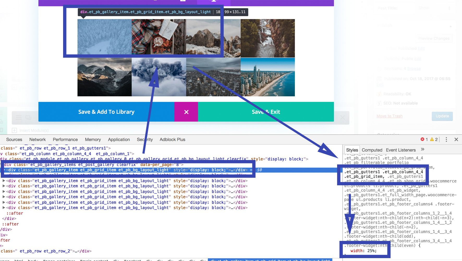
As you see, there are a bunch of CSS classes we could use to address the grid items. Keep in mind that the more selectors you combine, the higher the priority will your own CSS have. This is important so that your CSS does not get overwritten by another CSS.
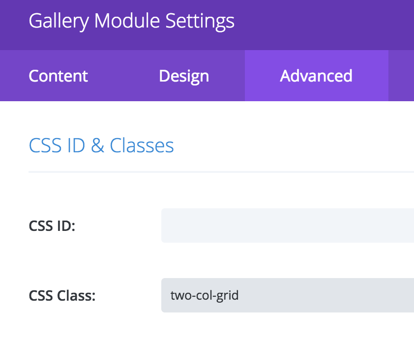
To take things even further, we suggest you add your own CSS class to the grid you want to style, so that you don’t affect other grids or even other modules on your page. For example, if you would just use “.et_pb_grid_item” to target, then not only all image grids but also the Portfolio and Filterable Portfolio modules items would get targeted. You surely don’t want this, so head over to the advanced tab of your Gallery and add the this class to the CSS class field (separate multiple classes with commas): “two-col-grid”. Notice that there is no dot in front of the class name.
Next you need to add the CSS to your themes Custom CSS field. Head over to your Backend and go to Divi->Theme Options. Scroll all the way to the bottom and add the following CSS to the Custom CSS Field:
@media all and (max-width: 767px) {
.two-col-grid.et_pb_gallery .et_pb_gallery_item.et_pb_grid_item {
width: 50%!important;
margin: 0!important;
}
Here we first target only those Gallery modules (et_pb_gallery) which also have the “two-col-grid” class. Then we target the grid item inside the Gallery and give it a width of 50% which will result in two columns.
Of course, you can have more columns if you like. For example, a width of 33.3% will result in three columns and 25% in four columns. The final result will look like this gallery (resize the browser and compare it to the gallery above.


its not working one column is still showing..one my phone view shop page
Are you maybe using a caching plugin? Otherwise send me the URL of your site and I’ll check out whats going wrong. As you see on this very page it should actually work. 🙂
i guess you didn’t set CSS Class on the gallery module ..
for me it works .. Thanks.
Hi, I heve problem with my portfolio. I need create porfolio (firtabled portfolio divi) with tabs, and what is very imoportant here that i must be with lightbox. Now my photo just open in next window.
So: tabs/firtabled portfolio where we can bigger images open in “pop-up” window.
will it work for shop modules?
1
Thank you for posting this. It helps a lot.
How can I do the same thing to Portfolio module?
thanks, its work..
Hi and thank you so much for this tutorial. I have an issue when I view the grid on my phone where photos get vertical stretched. Curiously If they are in a page this works perfectly but in a post page they get this annoying problem. Any help ?
Thank you
Hmm maybe this is a new Divi CSS introduced in one of the newer updated or via one of the plugins you use. Unfortunately I can’t see the error happening here on my phone.
I am having issues with that responsive setting. When there are 4 columns on desktop and then you set a custom column width for tablet/mobile, some elements stack to a same column and are not displayed inline.
Divi is not handling the responsiveness for columns very well, they should not stack on the same containers so that we can have freedom to set the width.
Thanks a million. This is wonderful, works like a charm 🙂
Is there a possibility to add a small gutter between the two columns and between the rows?
Elegant Themes probably has changed the HTML structure a litte bit. Have you inspected the HTML and saw any difference? For me it still seems to work well but I can’t remember if at any point in time I changed the CSS slightly..